
CDC
ART ESC — CASE STUDY
Life, Liberty & Public Health
An America250 exhibition — David J. Sencer CDC Museum
VISUAL DESIGNER·ENGAGED DIRECTLY BY THE MUSEUM CURATOR·ATLANTA, GA·FALL 2026
IN PRODUCTION — FINAL GALLERY PHOTOGRAPHY TO FOLLOW OPENING
To mark America's 250th anniversary, the David J. Sencer CDC Museum built a flagship exhibition tracing 250 years of public health — from Revolutionary-era camp hygiene to the founding of the nation's first federal health agencies to the CDC itself. The museum's curator brought me on to design the exhibition's full visual language, then turn it into more than 70 fabrication-ready graphics.
The Ask
The exhibition needed to hold two centuries of public health history — colonial-era sanitation, the U.S. Marine Hospital Service, the Quarantine Service, and the modern CDC — inside a single walk-through gallery, and make it feel like one continuous story instead of a timeline of disconnected facts. Every wall, panel, and printed graphic needed to carry a shared visual identity, sized and specified for an actual fabrication vendor to print and install.
Design Mockups
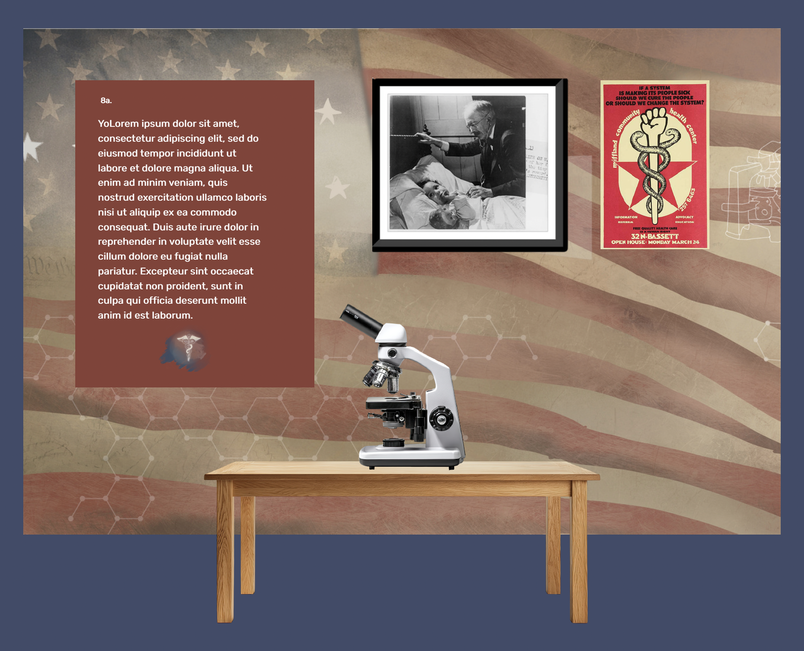
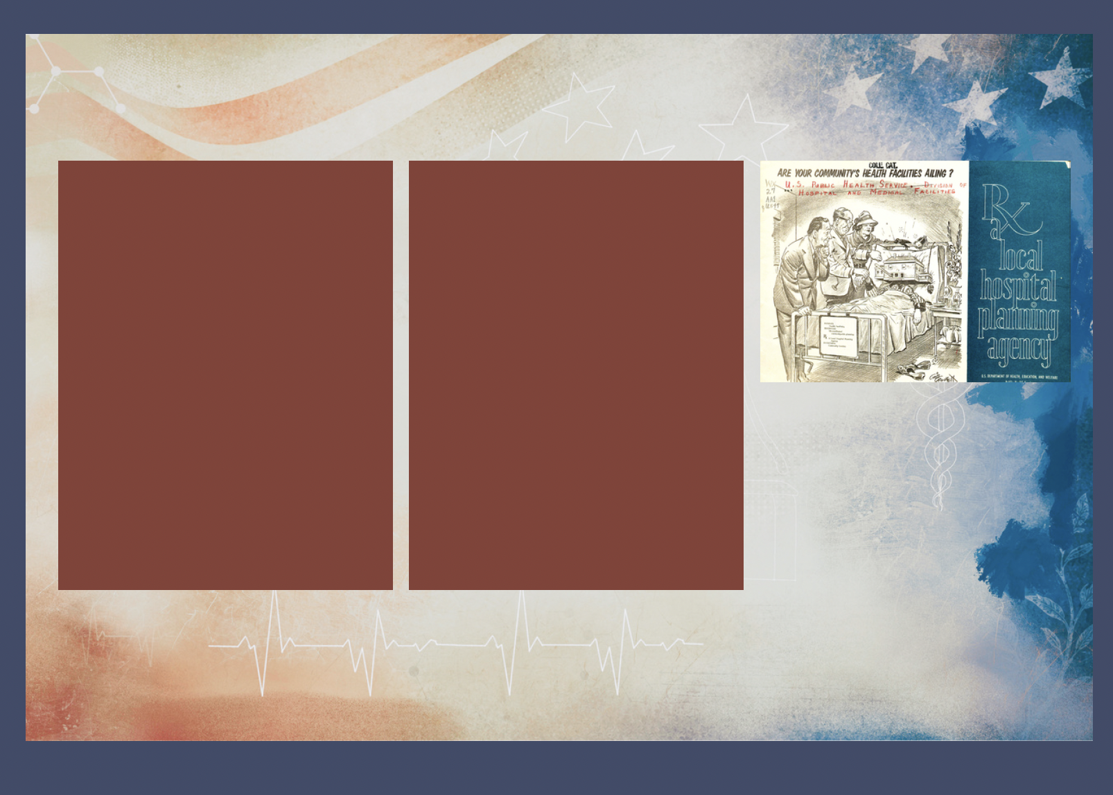
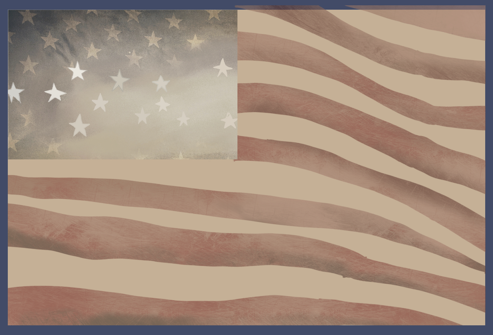
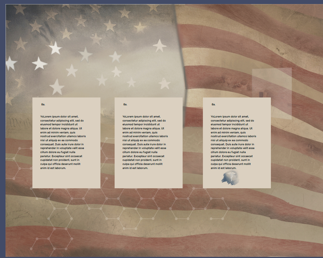
Early concept mockups the curator signed off on before anything went to fabrication — the wall elevation, the panel template, and the visitor path through all three eras.
The Approach
A visual system built to carry a national anniversary and two hundred and fifty years of public health history through one gallery, in one voice.
RESEARCH
Traced 250 years of public health history into a clear narrative arc, from colonial camp hygiene through the founding of federal health infrastructure to the CDC's modern work.
DESIGN
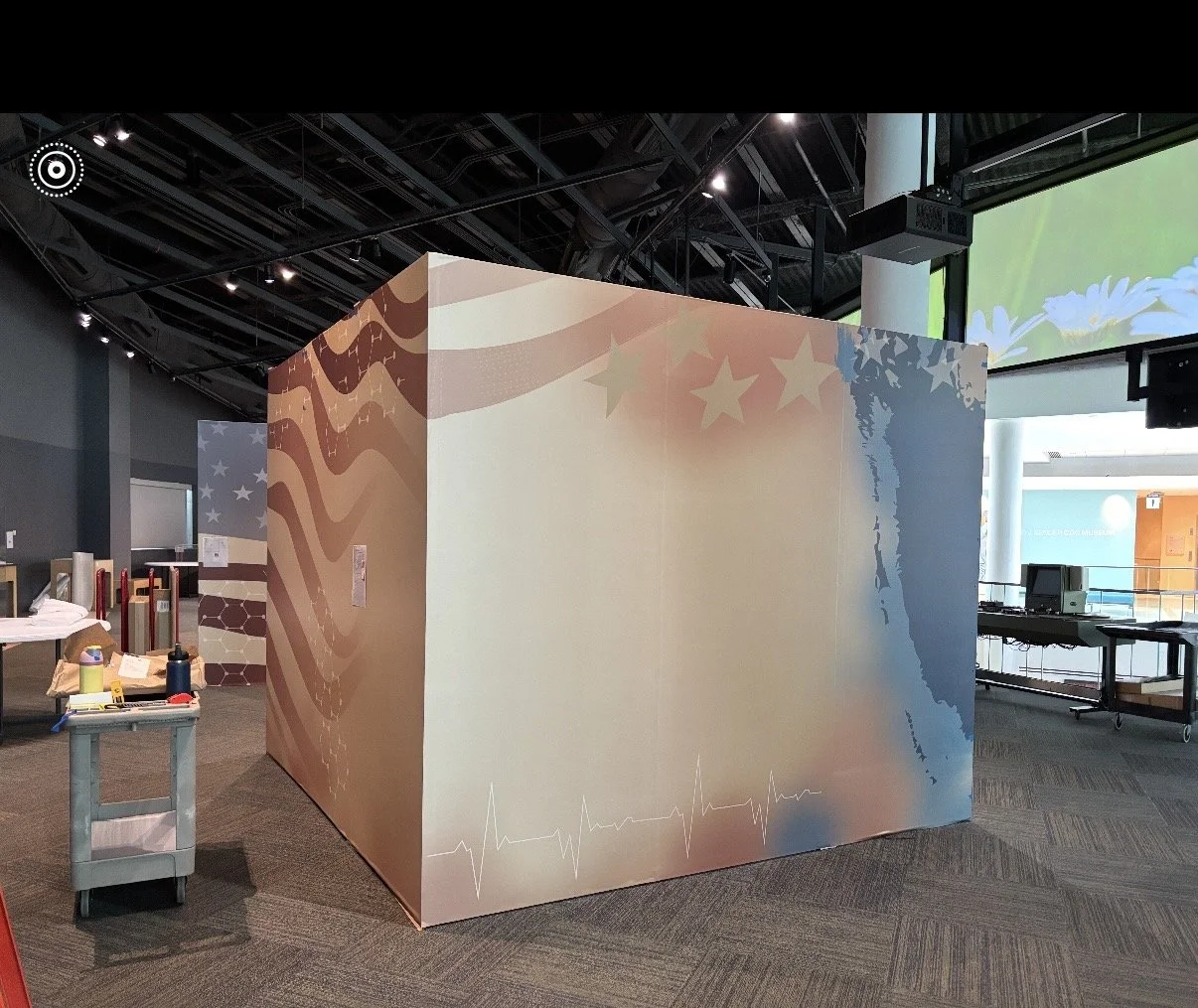
Built a visual identity that put Revolutionary-era Americana — flags, stars, founding-document typography — in direct conversation with modern science: DNA helixes, molecular structures, an EKG line woven straight into the stripes of the flag.
PRODUCE
Converted that identity into 28 production files covering more than 70 individual printed pieces, specified and CMYK-converted for fabrication at museum scale.
The Work
From a single identity mark to a full production specification — six parts of one exhibition system.
01 / Brand & Identity
One Mark for Two Centuries
LOGO & IDENTITY DESIGN
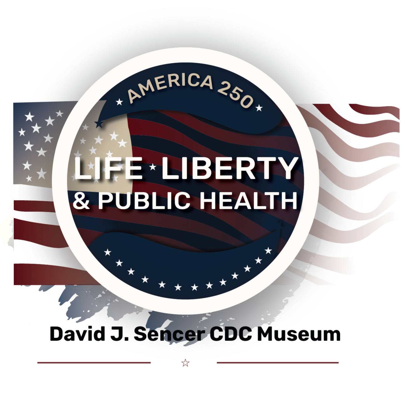
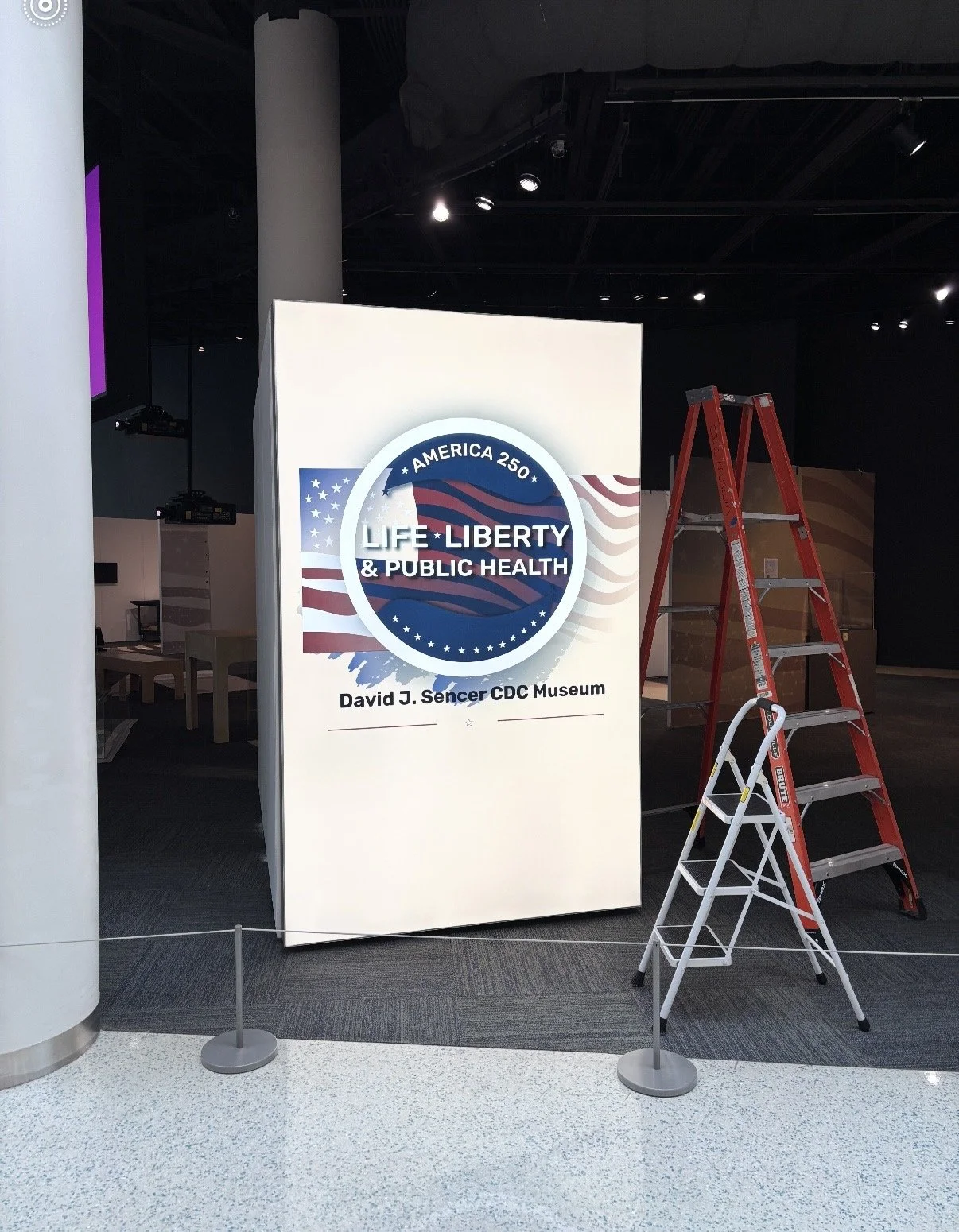
I designed the exhibition's identity mark — an America250 medallion built into a weathered flag, paired with the David J. Sencer CDC Museum wordmark. It became the visual anchor for every graphic in the space, from the lobby lightbox to the elevator vinyl.
02 / Environmental Graphics
A Flag You Can Walk Through
LARGE-FORMAT MURAL DESIGN
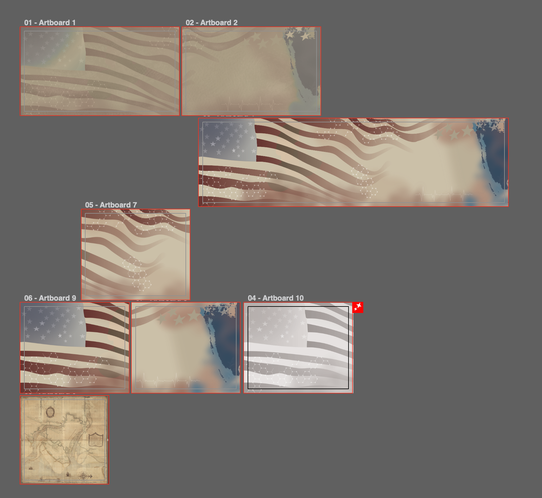
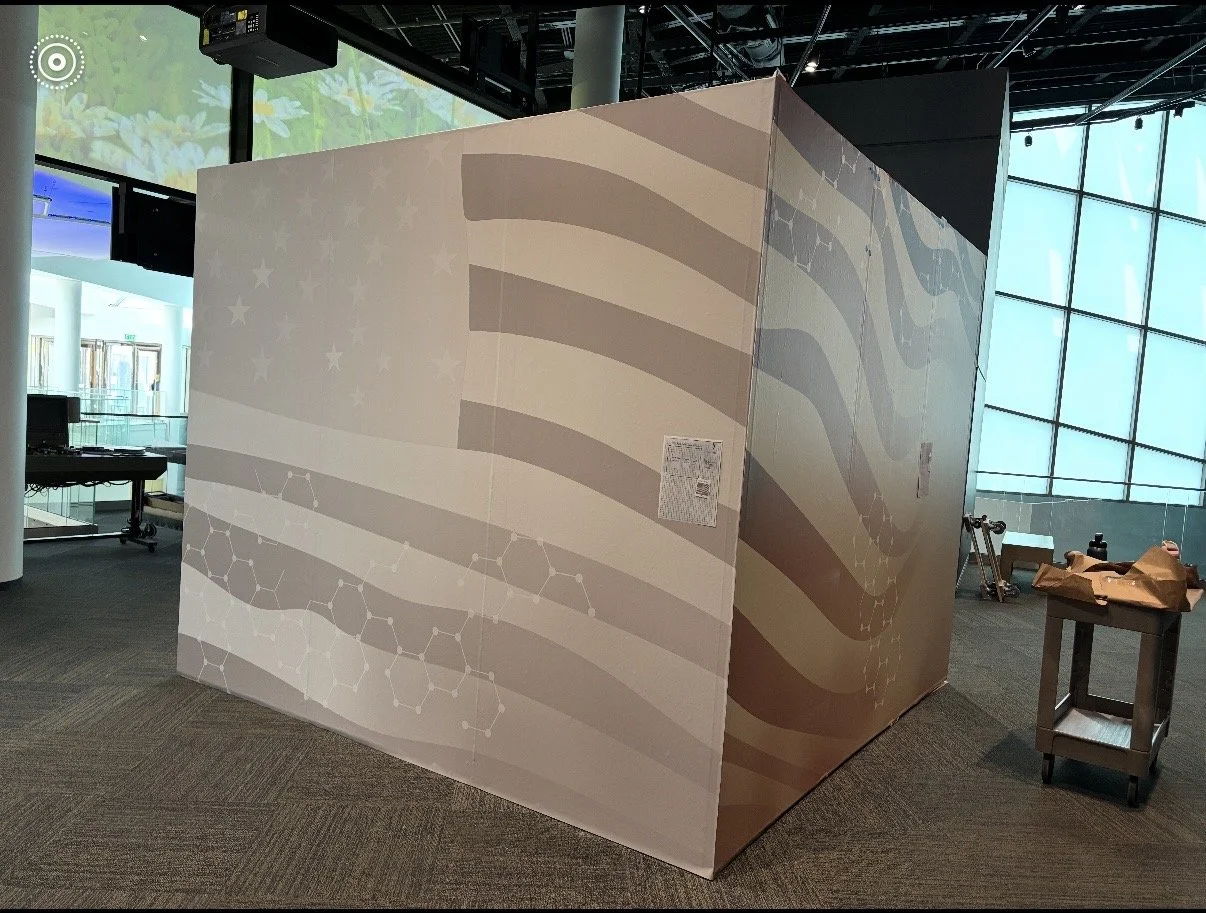
The exhibition's curved entry wall carries a single flag graphic split across panels up to 30 feet wide, its stripes fading into a molecular pattern and a single EKG line — a public health story told before a visitor reads a word of text. A muted sepia version repeats the motif in the mezzanine.
03 / Exhibit Text System
Seventy Panels, One Voice
INTERPRETIVE GRAPHIC DESIGN
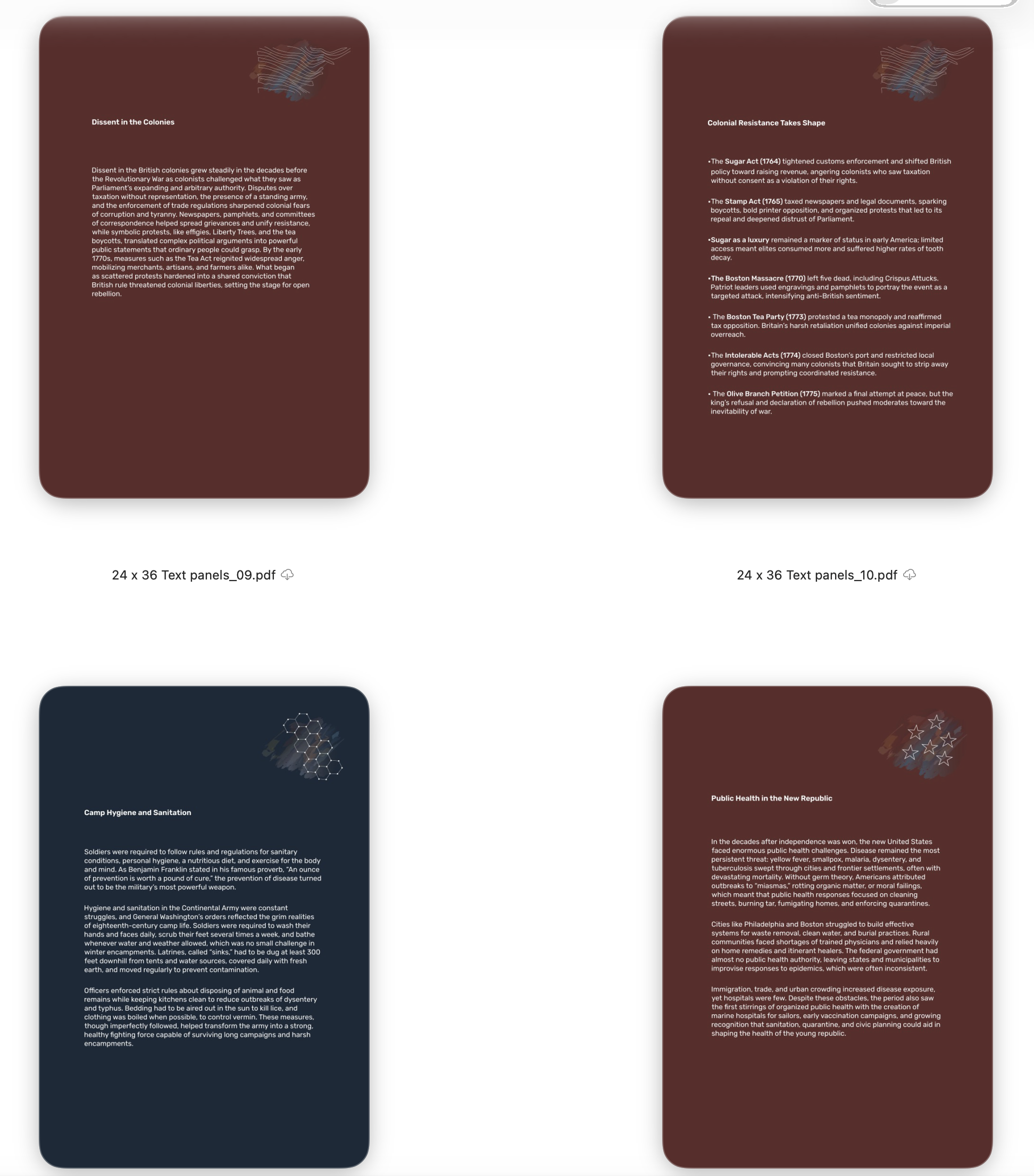
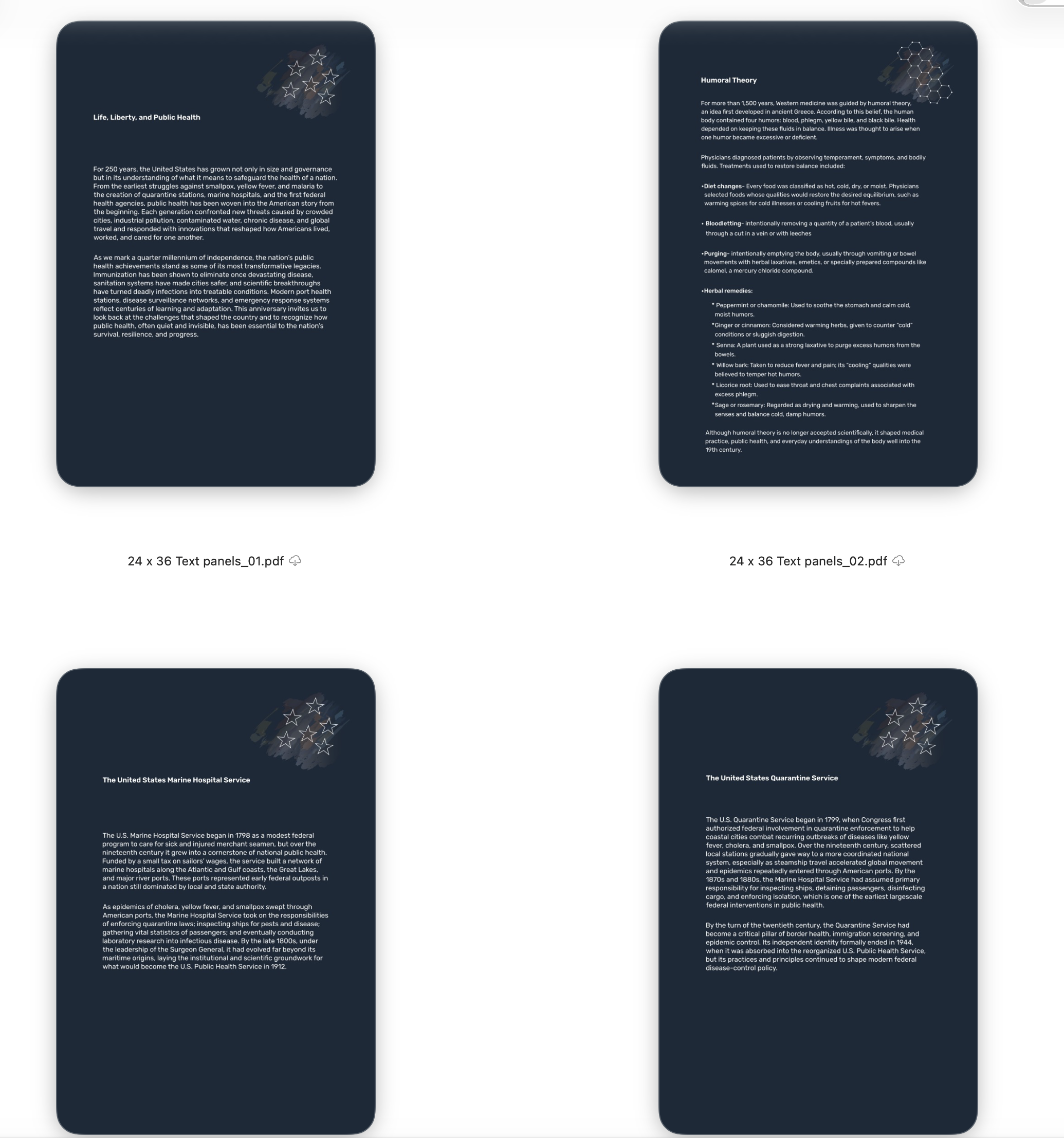
I designed the exhibition's full text-panel system — more than 70 panels across eight standardized sizes, color-coded by era (oxblood for the colonial period, navy for the federal public health institutions that followed) and rotating between a shared set of icon graphics.
04 / Original Illustration
Drawing the Cures People Actually Used
ILLUSTRATION
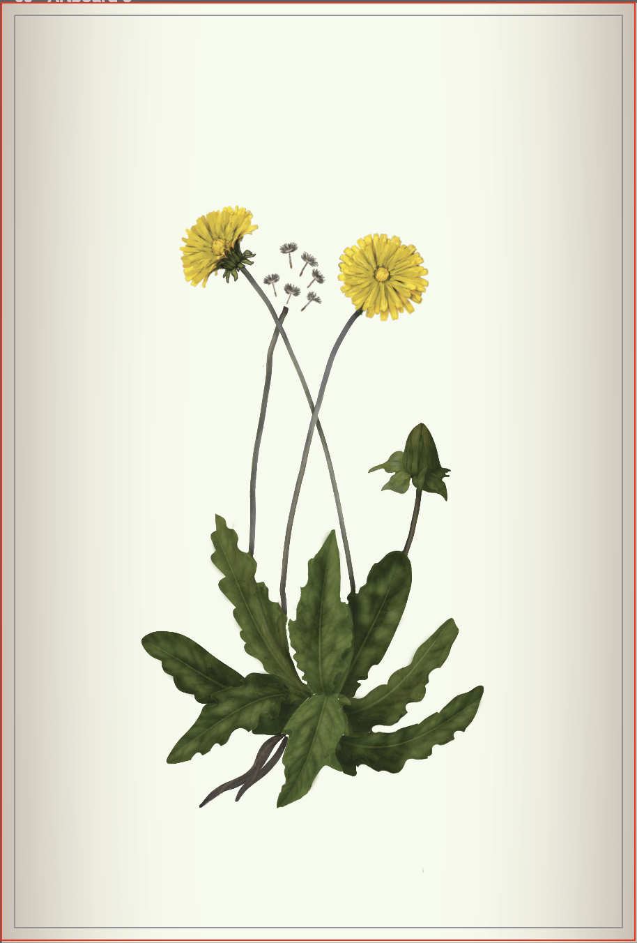
Some of the exhibit's history needed original artwork instead of archival photography. I illustrated period botanicals — dandelion among them — for the panel on 18th-century humoral theory, where diet and herbal remedies stood in for modern medicine.
05 / Production & Fabrication
From Design File to Museum Wall
PRINT PRODUCTION MANAGEMENT
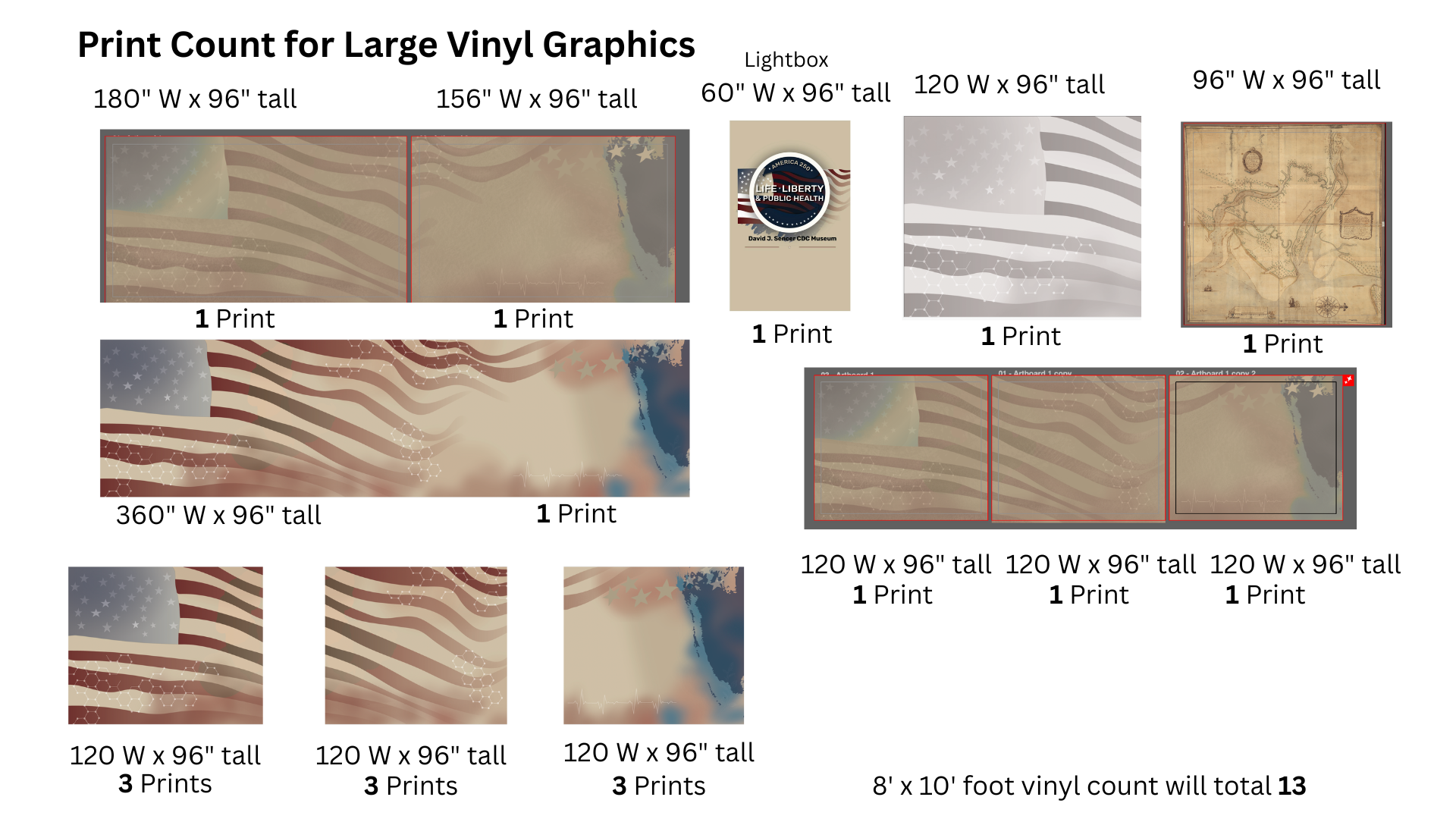
Beyond design, I managed the exhibition's full print specification — converting files to CMYK, laying out InDesign exports, and sizing every piece for the fabricator, from a 5-inch object label to a 30-foot mezzanine mural.
Final Gallery Photography
The exhibition is still in production - but final photography will be provided soon.
The Outcome
By the end of fall 2026, the museum curator had a complete, fabrication-ready visual system for the exhibition — a single design language holding together a lobby lightbox, a 30-foot mural, seventy-some text panels, and hand-drawn botanical illustration, all specified and ready for print.
What's left is the part no case study can shortcut: opening the doors. This page will carry final gallery photography once visitors can walk through it.
Two hundred fifty years of public health history, walked through as one continuous story — not because the facts lined up on their own, but because the design made them.
ANNA LECKIE, VISUAL DESIGNER