
Chateau Elan
CASE STUDY — ILLUSTRATION & WAYFINDING DESIGN
Redrawing
the Grounds
Chateau Elan
Cast Study 2025
An illustrated property map for Chateau Elan Winery & Resort — built for a guest's room-key sleeve and orientation brochure, and rebuilt once, on purpose, when the first direction wasn't the right fit.
A CLIENT Chateau Elan Winery & Resort
B ROLE Illustration & Design, ART ESC
C DELIVERABLES Property map · jacket sleeve · guest brochure
D TIMELINE~5 weeks, spring 2025
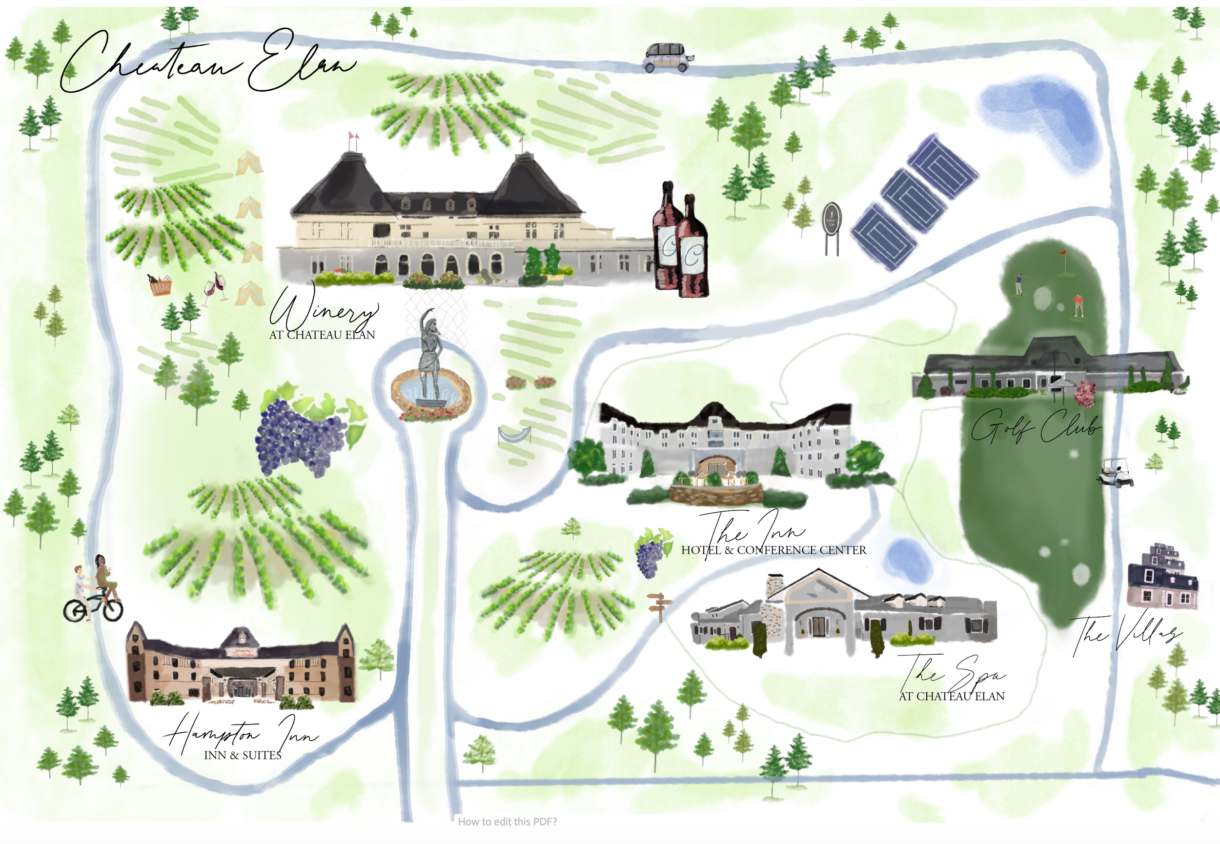
Finished Illustrated Map
THE BRIEF
A map guests would actually use
Chateau Elan needed a single illustrated map that could do two jobs at once: slip inside a guest's room-key jacket as a quick-glance orientation, and unfold into a full guest brochure with every venue on the property named and findable — the Winery, the Inn, the golf course, the spa, the villas, the vineyards between them.
The project started with a site visit and sketching day on the grounds, so the map could be built from the property's actual geography rather than a satellite photo — where the drive curves, where the vineyard rows sit against the golf course, which buildings a guest actually sees first when they arrive.
Format Jacket sleeve + brochure
Style Custom icon set, illustrated
Included Site visit, sketches, 2 revision rounds
Output Print-ready layout
PROCESS — FIRST DIRECTION
Starting graphic, starting bold
My first pass treated the property like a set of collectible icons — tennis courts, wine barrels, the Inn's turret, a horse and carriage — rendered as flat teal shapes over a warm tan base, closer to a pop-art badge sheet than a traditional resort map.
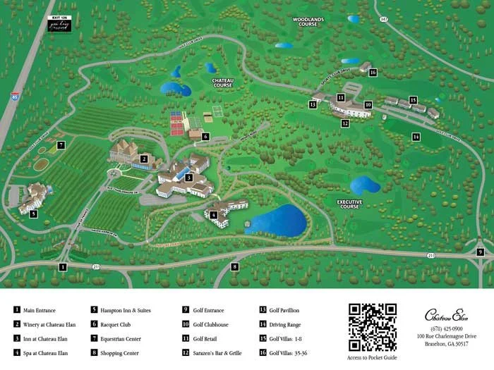
Original Map
The original Map was great, but Chateau wanted an artful creative piece to hand to guests at check in.
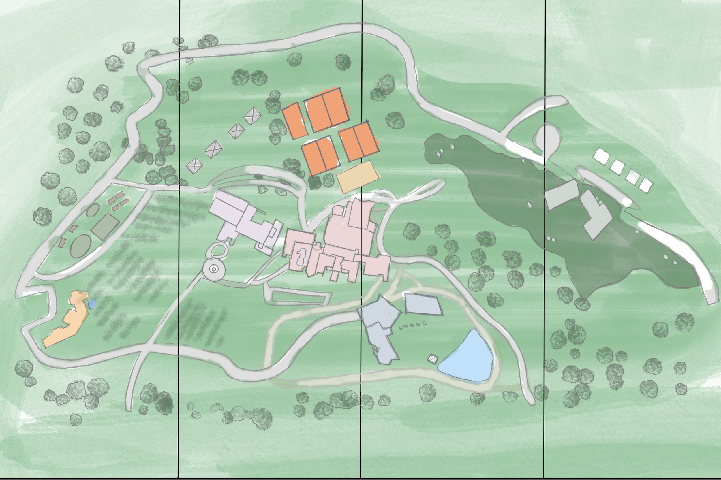
MOCK up layouts
We needed to look at how it would gold in order to get the spacing proportional while still being accurate.
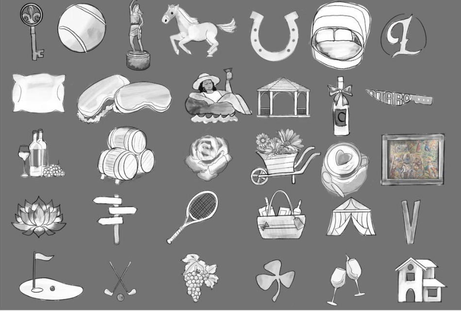
Iconography
Getting the iconography down for what we wanted to depict on the map and how we wanted to depict it.
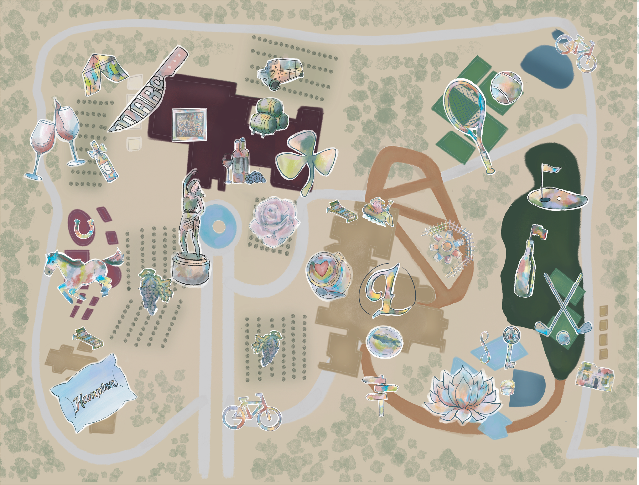
getting the layout correct
Every icon — the golf flag, the spa robe, the wheelbarrow of flowers, the horse and carriage — was drawn in line first, without color, so the shapes and proportions could be judged on their own before a palette started doing the work of making them read.
Proofing the palette on one icon first
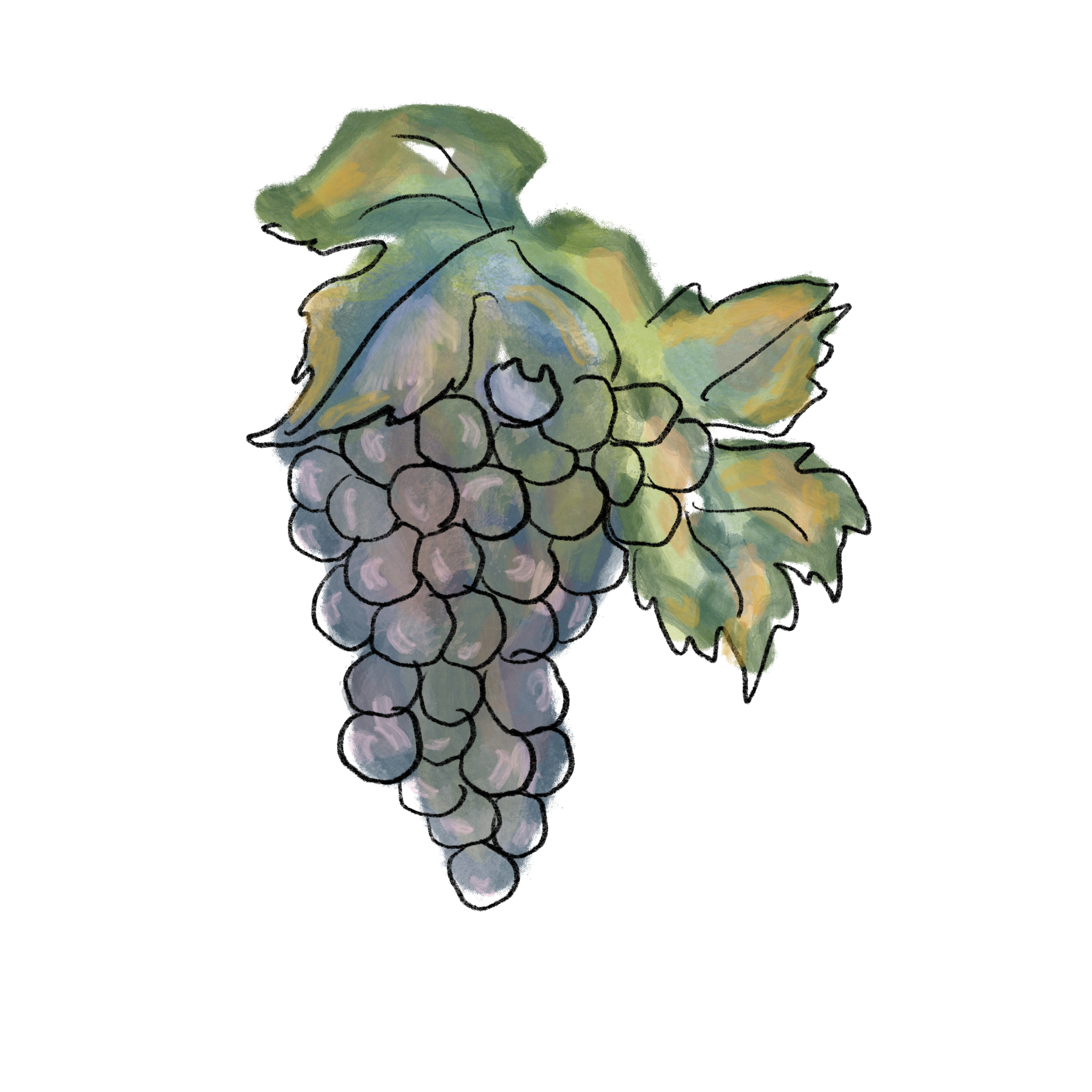
Seventeen swatches were proposed — teal, olive, brick, mustard, dusty rose — pulled toward the resort's own wine-country setting rather than a generic hospitality blue. Before it went anywhere near the full map, it was tested on a single grape cluster to see how the colors actually behaved next to line work and shadow.
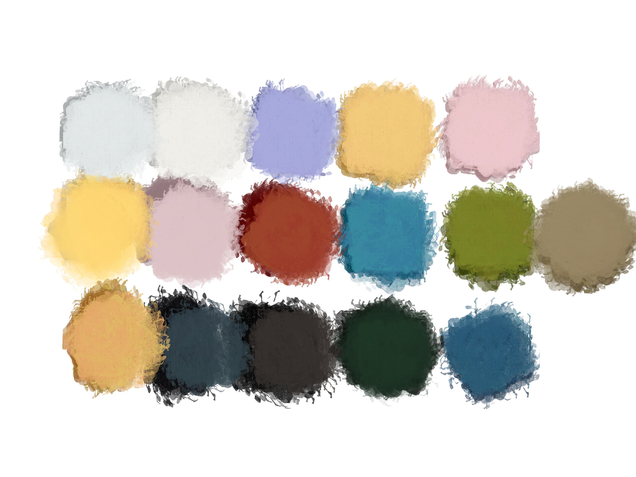
Color Pallette

REFLECTION
The instinct to keep going after a polished first draft — and the discipline to check a watercolor building against the real one, brick by brick — is most of what this project was actually about.